Creates a histogram of user-defined effects.
Usage
plot_hist(df, effect = NULL, bins = 30, density = FALSE)
Arguments
- df
A data frame or vector with the effects to be plotted.
- effect
A character defining the effects to be plotted. Ignored when 'df' is a vector.
- bins
Argument passed to ggplot2 (default is 30). Controls the number
of bins in the histogram.
- density
When TRUE (default is FALSE), a density curve is superimposed
onto the histogram.
Value
A histogram with x- and y-axes displaying the values and their frequency, respectively.
When density = TRUE, a density curve is superimposed onto the histogram.
Examples
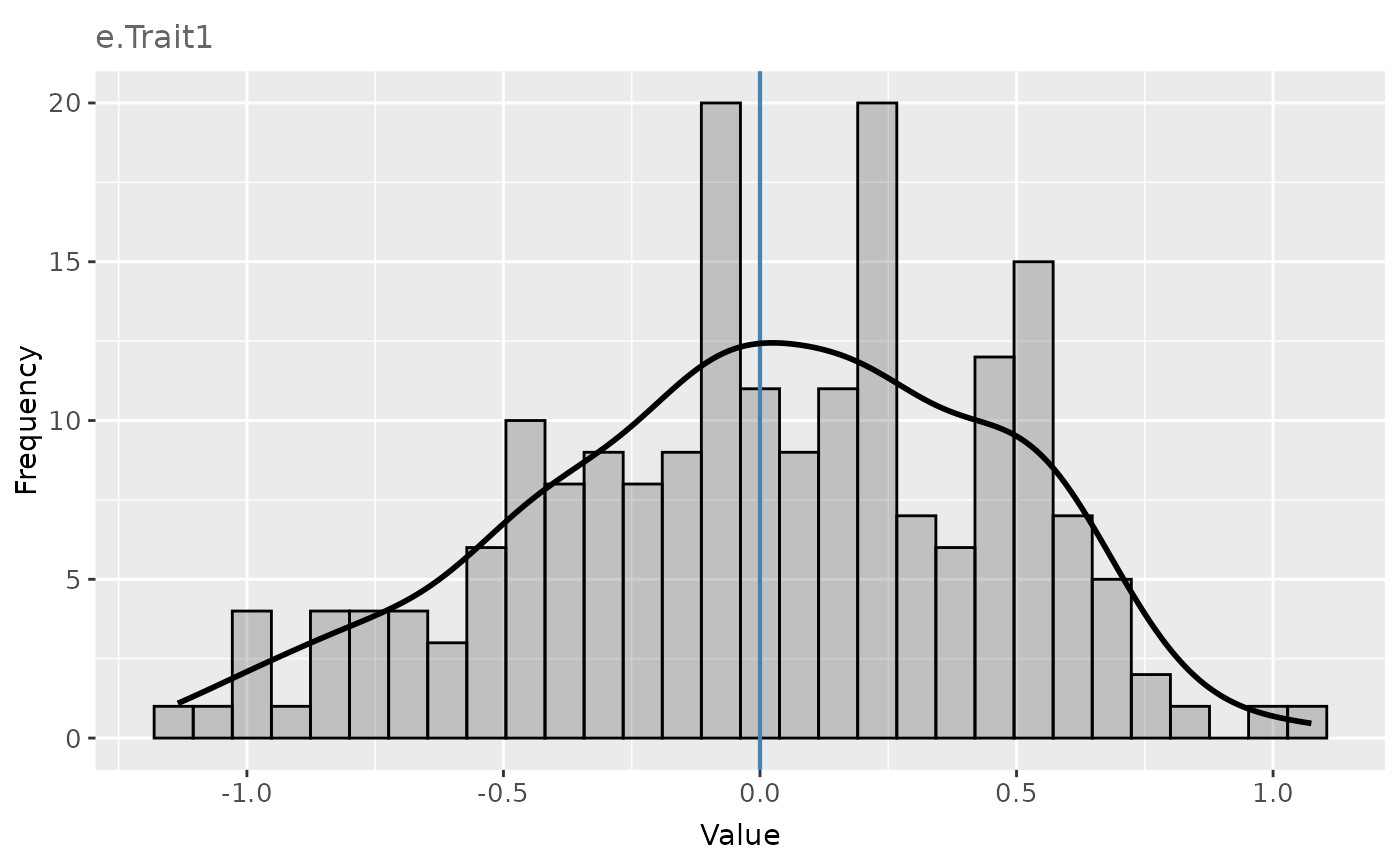
# Histogram of the simulated plot errors in the example data frame 'error_df_bivar'
# for Trait 1 in Environment 1.
error_df <- error_df_bivar[error_df_bivar$env == 1, ]
plot_hist(
  df = error_df,
  effect = "e.Trait1",
  density = TRUE
)